| Playing with Fourier |
Using Wolfram Research's Mathematica software is rather easy to see the
Fourier
Transform in action. In this page we can see first a typical example
that covers, step by step, how to go from a periodic curve to its
Fourier transform. Then the same is done but using discrete,
experimental data, and finally you can visit some very interesting
links found on the Internet. Please, click on the desired
section:
Mathematica Example
An example of Mathematica uses the function "Table" to build 50 numbers along a sinusoidal curve. Including the function "Random" in the expression adds some intentional noise:
Mathematica Input: data = Table[N[Sin[30 2 Pi n/200] + (Random[] - 1/2)], {n, 50}]
Output:
{0.352195, 1.17105, -0.0260159, -0.920484, -1.01027, -0.664937, 0.132787, 1.24509, 0.321144, 0.164103, -0.434612, -0.722275, -0.618601, 0.323596, 1.26506, 0.810469, 0.000699291, -1.37978, -0.626566, 0.00277814, 0.959846, 0.800671, 0.765419, -0.796768, -0.89235, -0.458167, 0.600452, 0.574772, 0.426939, -0.29323, -0.841352, -1.12138, -0.703222, 0.630452, 1.09326, 0.688685, 0.106362, -1.1442, -0.480814, 0.378216, 0.414679, 0.686636, -0.045231, -0.712347, -1.04517, -0.20182, -0.0016328, 0.535478, 1.1562, -0.243653}
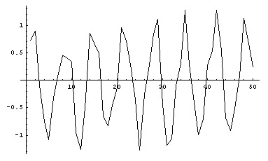
The following command builds a graphic from the data:
Mathematica Input: ListPlot[data, PlotJoined -> True]
Output:
Now, the Fourier function is used. Please note how the output is based on complex numbers:
Mathematica Input: Fourier[data]
Output:
{0.272532 + 0i, 0.109917 + 0.0631259i, 0.509287 + 0.00960342i, 0.400006 - 0.16683 i, 0.092665 - 0.31786 i, 0.433018 - 0.705729 i, 0.429926 - 0.312605 i, 1.54676 - 1.61133 i, -1.24355 + 1.52961 i, -0.760812 + 0.441231 i, -0.121733 + 0.886774 i, -0.101475 + 0.30707 i, -0.0828861 + 0.266597 i, 0.0299108 + 0.373315 i, -0.35915 + 0.229545 i, 0.303116 + 0.0226354 i, -0.147611 + 0.0653297 i, 0.298138 + 0.24022 i, 0.0242523 + 0.421094 i, 0.334169 + 0.345331 i, -0.192541 + 0.0547607 i, -0.0493994 + 0.238828 i, -0.298691 + 0.451972 i, -0.138262 - 0.0825516 i, 0.236489 + 0.1012 i, 0.306135 + 0 i, 0.236489 - 0.1012 i, -0.138262 + 0.0825516 i, -0.298691 - 0.451972 i, -0.0493994 - 0.238828 i, -0.192541 - 0.0547607 i, 0.334169 - 0.345331 i, 0.0242523 - 0.421094 i, 0.298138 -
0.24022 i, -0.147611 - 0.0653297 i, 0.303116 - 0.0226354 i, -0.35915 - 0.229545 i, 0.0299108 - 0.373315 i, -0.0828861 - 0.266597 i, -0.101475 - 0.30707 i, -0.121733 - 0.886774 i, -0.760812 - 0.441231i,
-1.24355 - 1.52961 i, 1.54676 + 1.61133 i, 0.429926 + 0.312605 i, 0.433018 + 0.705729 i, 0.092665 + 0.31786 i, 0.400006 + 0.16683 i, 0.509287 - 0.00960342 i, 0.109917\
- 0.0631259 i}
In order to graphically represent these values as frequencies, and not as complex numbers, the Mathematica function Abs is used. With complex numbers, "Abs" in Mathematica returns the modulus of a complex number. You can picture it as the hypotenuse of a triangle where the other two sides are the real part and the imaginary part (an imaginary number can be represented in a two dimensional space with two axes, one for the real part and one for the imaginary part, see Links below)
Mathematica Input: Abs[Fourier[data]]
Output:
{0.0314192, 0.146825, 0.206678, 0.311576, 0.752131, 0.457671, 0.766983, 2.11725, 2.22655, 0.454635, 0.420669, 0.452837, 0.526866, 0.148231, 0.27424, 0.240827, 0.515968, 0.595521, 0.150395, 0.162775, 0.22446, 0.261954, 0.296407, 0.30967, 0.33853, 0.214429, 0.33853, 0.30967, 0.296407, 0.261954, 0.22446, 0.162775, 0.150395, 0.595521, 0.515968, 0.240827, 0.27424, 0.148231, 0.526866, 0.452837, 0.420669, 0.454635, 2.22655, 2.11725, 0.766983, 0.457671, 0.752131, 0.311576, 0.206678, 0.146825}
Now, it's easy to Plot the Fourier Transform:
Mathematica Input: ListPlot[Abs[Fourier[data]], PlotJoined -> True, PlotRange -> All]
Output:
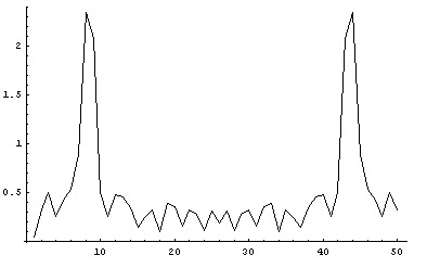
That is: we have gone from a time domain (admitting the horizontal axis represented time) to a frequency domain!. Now the Y axis represents amplitude and the X axis represents Frequency.
Now, let's go through the inverse path. Let's calculate again the numerical transform:
Mathematica Input: Fourier[data];
Output: (none, calculations have been done, but the ";" in the last input avoids to see the output, used here for clarity.
Now, we use the "InverseFourier" function that I think, doesn't need an explanation :). The "%" symbol expresses that the last output is used as input.
Mathematica Input: InverseFourier[%]
Output:
{0.435826, 1.24548, -0.0183887, -0.308943, -1.20097, -0.661694, 0.733461, 0.555328, 1.05145, 0.134215, -0.626314, -1.19408, -0.207967, 0.13464, 0.733113, 0.476667, -0.0910976, -0.604641, -1.0396, 0.317966, 1.00001, 1.32198, -0.101435, -0.51265, -0.935817, -1.01128, 0.725971, 1.24735, 0.574171, 0.150409, -0.316508, -0.759035, -0.286299, 0.10398, 0.809807, 0.522831, 0.112651, -0.481716, -1.23232, -0.453836, 0.512765, 0.573981, 0.616297, -0.859588, -0.987244, -0.835781, 0.526749, 1.10412, 1.25759, -0.324497}
And now, plotting these values we can observe that we are back at home again, that is, with the same initial set of data
Mathematica Input: ListPlot[%, PlotJoined -> True]
Output:
Fourier Transform for a discrete set of data
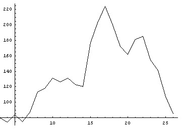
Mathematical functions are nice to play with, but in the real world, we usually start from experimental or observational data. Here are some data representing glucose values in mg/dl from a diabetic patient. Every single data was collected every 30 minutes:
Mathematica Input: angela = {75, 91, 80, 74, 84, 75, 87, 113, 118, 131, 126, 131, 123, 120, 177, 203, 224, 200, 172, 162, 181, 185, 155, 141, 107, 85}
Output:
{75, 91, 80, 74, 84, 75, 87, 113, 118, 131, 126, 131, 123, 120, 177, 203, 224, 200, 172, 162, 181, 185, 155, 141, 107, 85}
Mathematica Input: ListPlot[angela, PlotJoined -> True, PlotRange -> All]
Output:
Since we already know the procedure, we'll save the intermediate steps:
Mathematica Input: Abs[Fourier[angela]]
Output:
{670.717, 144.827, 32.7366, 19.1849, 45.1393, 19.6173, 10.729, 5.04755, 12.4811, 4.18371, 7.23073, 9.88338, 6.95116, 0.392232, 6.95116, 9.88338,
7.23073, 4.18371, 12.4811, 5.04755, 10.729, 19.6173, 45.1393, 19.1849, 32.7366, 144.827}
Mathematica Input: ListPlot[Abs[Fourier[angela]], PlotJoined -> True, PlotRange -> All]
Output:
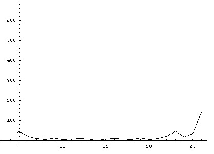
Here the important fact to observe is the amplitude, reaching a value of almost 150mg/dl in the last point of the graphic (a normal value of glycemia is about 90 mg/dl), just after having lunch.
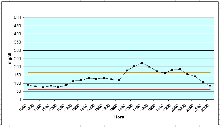
Another graph from experimentation: this one shows the time (meal started at 15:15) and sugar levels in blood. It's interesting to observe that a high percentage of values are inside a band that represents, more or less, normal levels. However, the most important thing is that, first: no hipoglucemya were present and second, only a 56% of insuline was used with respect to the normal quantity of insuline for that patient.,
Links
Some interesting links to Fourier Series and the Fourier Transform (FT):
Mathematica Example
An example of Mathematica uses the function "Table" to build 50 numbers along a sinusoidal curve. Including the function "Random" in the expression adds some intentional noise:
Mathematica Input: data = Table[N[Sin[30 2 Pi n/200] + (Random[] - 1/2)], {n, 50}]
Output:
{0.352195, 1.17105, -0.0260159, -0.920484, -1.01027, -0.664937, 0.132787, 1.24509, 0.321144, 0.164103, -0.434612, -0.722275, -0.618601, 0.323596, 1.26506, 0.810469, 0.000699291, -1.37978, -0.626566, 0.00277814, 0.959846, 0.800671, 0.765419, -0.796768, -0.89235, -0.458167, 0.600452, 0.574772, 0.426939, -0.29323, -0.841352, -1.12138, -0.703222, 0.630452, 1.09326, 0.688685, 0.106362, -1.1442, -0.480814, 0.378216, 0.414679, 0.686636, -0.045231, -0.712347, -1.04517, -0.20182, -0.0016328, 0.535478, 1.1562, -0.243653}
The following command builds a graphic from the data:
Mathematica Input: ListPlot[data, PlotJoined -> True]
Output:
Now, the Fourier function is used. Please note how the output is based on complex numbers:
Mathematica Input: Fourier[data]
Output:
{0.272532 + 0i, 0.109917 + 0.0631259i, 0.509287 + 0.00960342i, 0.400006 - 0.16683 i, 0.092665 - 0.31786 i, 0.433018 - 0.705729 i, 0.429926 - 0.312605 i, 1.54676 - 1.61133 i, -1.24355 + 1.52961 i, -0.760812 + 0.441231 i, -0.121733 + 0.886774 i, -0.101475 + 0.30707 i, -0.0828861 + 0.266597 i, 0.0299108 + 0.373315 i, -0.35915 + 0.229545 i, 0.303116 + 0.0226354 i, -0.147611 + 0.0653297 i, 0.298138 + 0.24022 i, 0.0242523 + 0.421094 i, 0.334169 + 0.345331 i, -0.192541 + 0.0547607 i, -0.0493994 + 0.238828 i, -0.298691 + 0.451972 i, -0.138262 - 0.0825516 i, 0.236489 + 0.1012 i, 0.306135 + 0 i, 0.236489 - 0.1012 i, -0.138262 + 0.0825516 i, -0.298691 - 0.451972 i, -0.0493994 - 0.238828 i, -0.192541 - 0.0547607 i, 0.334169 - 0.345331 i, 0.0242523 - 0.421094 i, 0.298138 -
0.24022 i, -0.147611 - 0.0653297 i, 0.303116 - 0.0226354 i, -0.35915 - 0.229545 i, 0.0299108 - 0.373315 i, -0.0828861 - 0.266597 i, -0.101475 - 0.30707 i, -0.121733 - 0.886774 i, -0.760812 - 0.441231i,
-1.24355 - 1.52961 i, 1.54676 + 1.61133 i, 0.429926 + 0.312605 i, 0.433018 + 0.705729 i, 0.092665 + 0.31786 i, 0.400006 + 0.16683 i, 0.509287 - 0.00960342 i, 0.109917\
- 0.0631259 i}
In order to graphically represent these values as frequencies, and not as complex numbers, the Mathematica function Abs is used. With complex numbers, "Abs" in Mathematica returns the modulus of a complex number. You can picture it as the hypotenuse of a triangle where the other two sides are the real part and the imaginary part (an imaginary number can be represented in a two dimensional space with two axes, one for the real part and one for the imaginary part, see Links below)
Mathematica Input: Abs[Fourier[data]]
Output:
{0.0314192, 0.146825, 0.206678, 0.311576, 0.752131, 0.457671, 0.766983, 2.11725, 2.22655, 0.454635, 0.420669, 0.452837, 0.526866, 0.148231, 0.27424, 0.240827, 0.515968, 0.595521, 0.150395, 0.162775, 0.22446, 0.261954, 0.296407, 0.30967, 0.33853, 0.214429, 0.33853, 0.30967, 0.296407, 0.261954, 0.22446, 0.162775, 0.150395, 0.595521, 0.515968, 0.240827, 0.27424, 0.148231, 0.526866, 0.452837, 0.420669, 0.454635, 2.22655, 2.11725, 0.766983, 0.457671, 0.752131, 0.311576, 0.206678, 0.146825}
Now, it's easy to Plot the Fourier Transform:
Mathematica Input: ListPlot[Abs[Fourier[data]], PlotJoined -> True, PlotRange -> All]
Output:
That is: we have gone from a time domain (admitting the horizontal axis represented time) to a frequency domain!. Now the Y axis represents amplitude and the X axis represents Frequency.
Now, let's go through the inverse path. Let's calculate again the numerical transform:
Mathematica Input: Fourier[data];
Output: (none, calculations have been done, but the ";" in the last input avoids to see the output, used here for clarity.
Now, we use the "InverseFourier" function that I think, doesn't need an explanation :). The "%" symbol expresses that the last output is used as input.
Mathematica Input: InverseFourier[%]
Output:
{0.435826, 1.24548, -0.0183887, -0.308943, -1.20097, -0.661694, 0.733461, 0.555328, 1.05145, 0.134215, -0.626314, -1.19408, -0.207967, 0.13464, 0.733113, 0.476667, -0.0910976, -0.604641, -1.0396, 0.317966, 1.00001, 1.32198, -0.101435, -0.51265, -0.935817, -1.01128, 0.725971, 1.24735, 0.574171, 0.150409, -0.316508, -0.759035, -0.286299, 0.10398, 0.809807, 0.522831, 0.112651, -0.481716, -1.23232, -0.453836, 0.512765, 0.573981, 0.616297, -0.859588, -0.987244, -0.835781, 0.526749, 1.10412, 1.25759, -0.324497}
And now, plotting these values we can observe that we are back at home again, that is, with the same initial set of data
Mathematica Input: ListPlot[%, PlotJoined -> True]
Output:
Fourier Transform for a discrete set of data
Mathematical functions are nice to play with, but in the real world, we usually start from experimental or observational data. Here are some data representing glucose values in mg/dl from a diabetic patient. Every single data was collected every 30 minutes:
Mathematica Input: angela = {75, 91, 80, 74, 84, 75, 87, 113, 118, 131, 126, 131, 123, 120, 177, 203, 224, 200, 172, 162, 181, 185, 155, 141, 107, 85}
Output:
{75, 91, 80, 74, 84, 75, 87, 113, 118, 131, 126, 131, 123, 120, 177, 203, 224, 200, 172, 162, 181, 185, 155, 141, 107, 85}
Mathematica Input: ListPlot[angela, PlotJoined -> True, PlotRange -> All]
Output:
Since we already know the procedure, we'll save the intermediate steps:
Mathematica Input: Abs[Fourier[angela]]
Output:
{670.717, 144.827, 32.7366, 19.1849, 45.1393, 19.6173, 10.729, 5.04755, 12.4811, 4.18371, 7.23073, 9.88338, 6.95116, 0.392232, 6.95116, 9.88338,
7.23073, 4.18371, 12.4811, 5.04755, 10.729, 19.6173, 45.1393, 19.1849, 32.7366, 144.827}
Mathematica Input: ListPlot[Abs[Fourier[angela]], PlotJoined -> True, PlotRange -> All]
Output:
Here the important fact to observe is the amplitude, reaching a value of almost 150mg/dl in the last point of the graphic (a normal value of glycemia is about 90 mg/dl), just after having lunch.
Another graph from experimentation: this one shows the time (meal started at 15:15) and sugar levels in blood. It's interesting to observe that a high percentage of values are inside a band that represents, more or less, normal levels. However, the most important thing is that, first: no hipoglucemya were present and second, only a 56% of insuline was used with respect to the normal quantity of insuline for that patient.,
Links
Some interesting links to Fourier Series and the Fourier Transform (FT):
- Since complex numbers are often used in order to describe the maths associated with Fourier formulae, this is a very good "refreshment" for this interesting area of calculus.
- About the FT, this is from Wolfram MathWorld, the same people that wrote Mathematica. Just click here.
- Wikipedia has also excellent links to Fourier Series , the Continuous and Discrete Fourier Transform and the Discrete-time Fourier Transform.
- For playing interactively with Fourier Series and some functions such as a Sawtooth, Rectangular pulses and so on, just visit this java app.
- Another great Java app where you can assign values to coefficients and then hear sounds from the resulting waves is located here.
16th, September, 2006
Back to Home page
Back to Home page